
Measured Design System
Helping businesses visualize their current ad spend.

Role
Product Design Intern
TImeline
Summer 2023 (10 Weeks)
Tools
Figma
Skills
UI/UX Design
Design Systems
Product
Overview
In Summer 2023, I interned for Measured whilst they were in the midst of a major redesign. I was assigned a range of small tasks, but my main role was redesigning the main dashboard and creating components for the new UI to be used throughout the rest of the platform.
01.
Problem
In my time at Measured, our main goal was to completely revamp the User Experience and Interface.
I owned the redesign of the Main Dashboard, as well as the updates to the design system based on the redesign.
The original dashboard design
02.
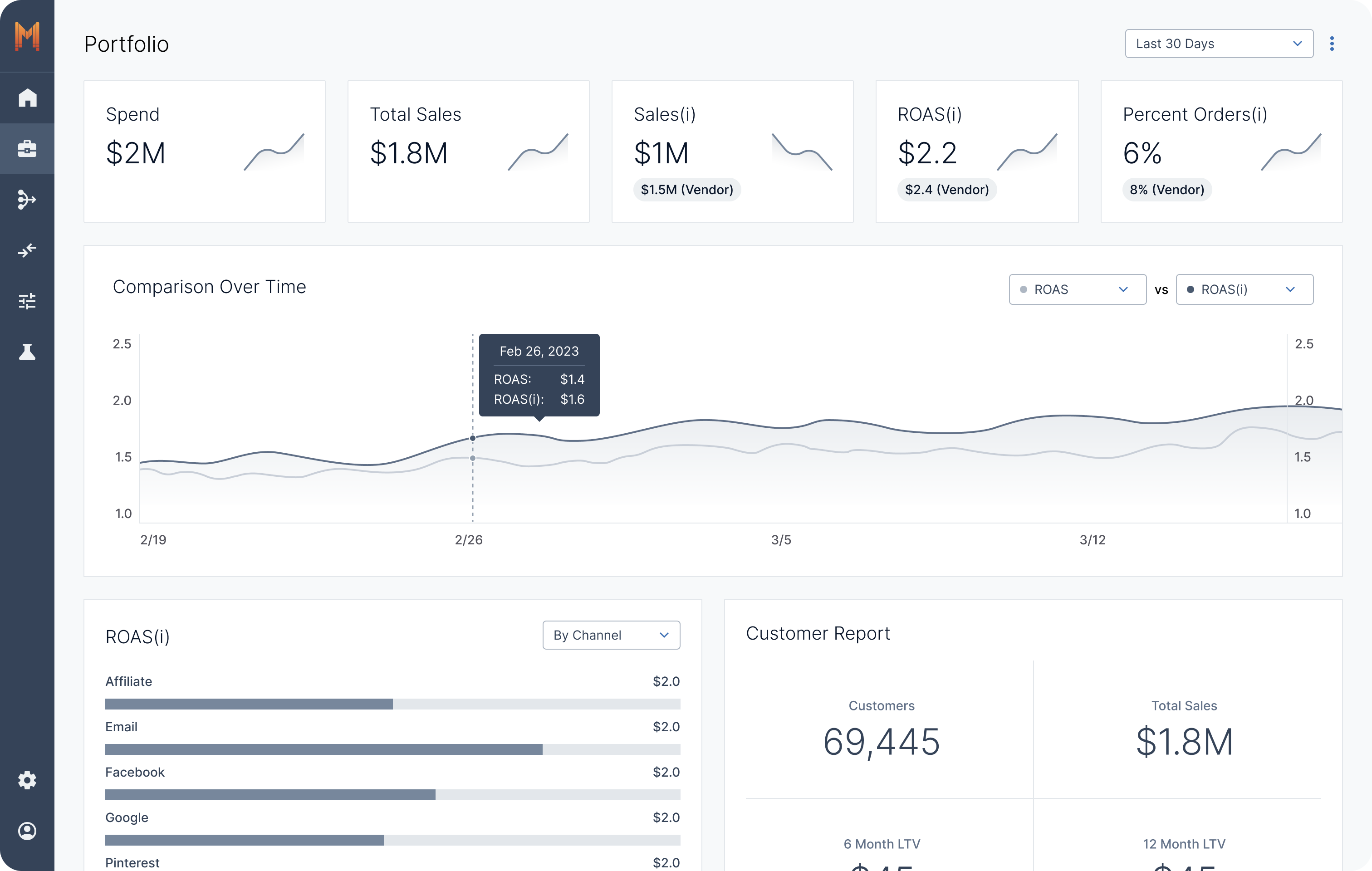
Solution
A simple and easy-to-navigate dashboard for all your marketing needs.
Features
1. Our Most Important Metrics at a Glance
Users will have a consolidated view of all their portfolio metrics and trends as well as a overview of selected channels and tactics.
2. Drilldown Metrics
Users will have a consolidated view of all their portfolio metrics and trends as well as a overview of selected channels and tactics.
3. View Opportunities and Updates in the Sidebar
The sidebar includes opportunities for optimization, recommended tests to conduct, and notifications that the users will need to know.
4. Add New Channels/Tactics to Dashboard
Users will be able to easily customize what metrics are shown on the main dashboard with this simple flow.
03.
Creating the Design System
My process of creating a new design system involved using the new design of the dashboard as the baseline. A large part of my job included prototyping the main dashboard to support testing and providing product managers and developers and full understanding of our design vision.
Being in charge of prototyping and consolidating designs to become streamlined and easy to translate into code honed my ability to create robust, reusable components that enhance the overall design system.
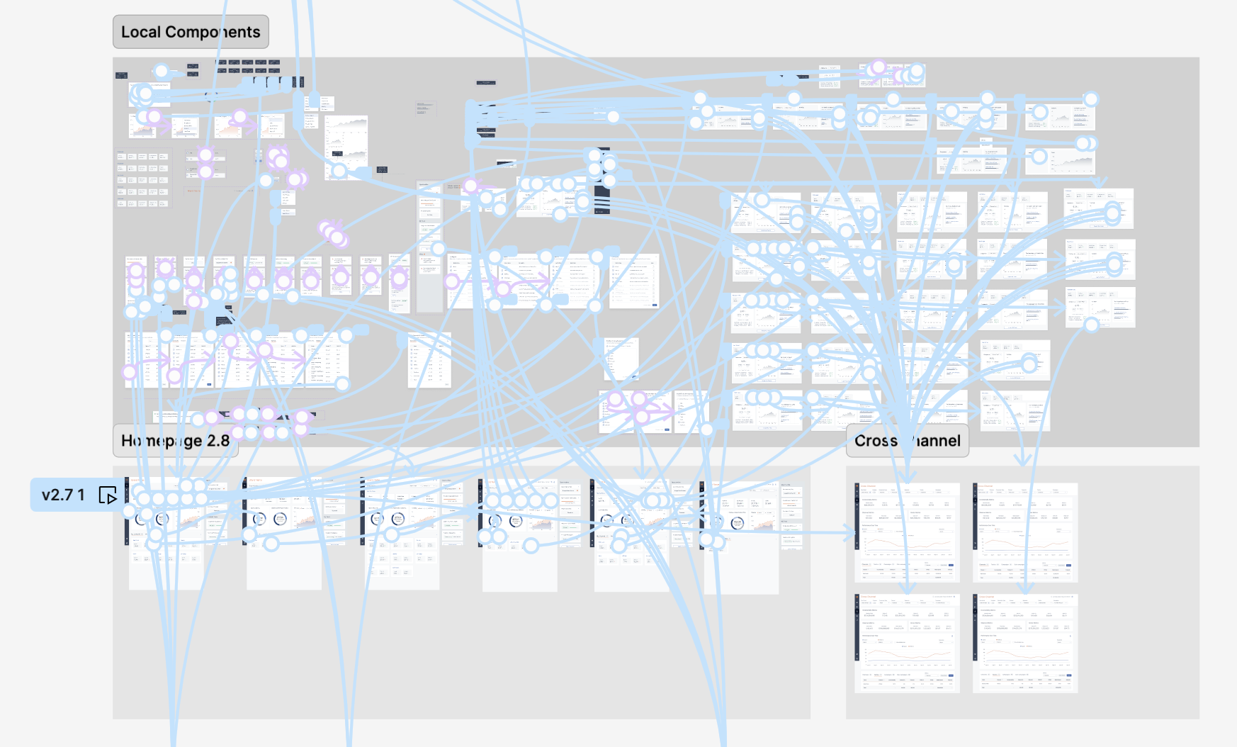
The full prototype
After prototyping the design, I transitioned to building large-scale components for the global design system. My focus was on creating highly reusable components with multiple boolean toggles, allowing for seamless customization based on specific requirements. I also ensured that card variations were structured for easy reuse, improving efficiency across the system.
Metric Component
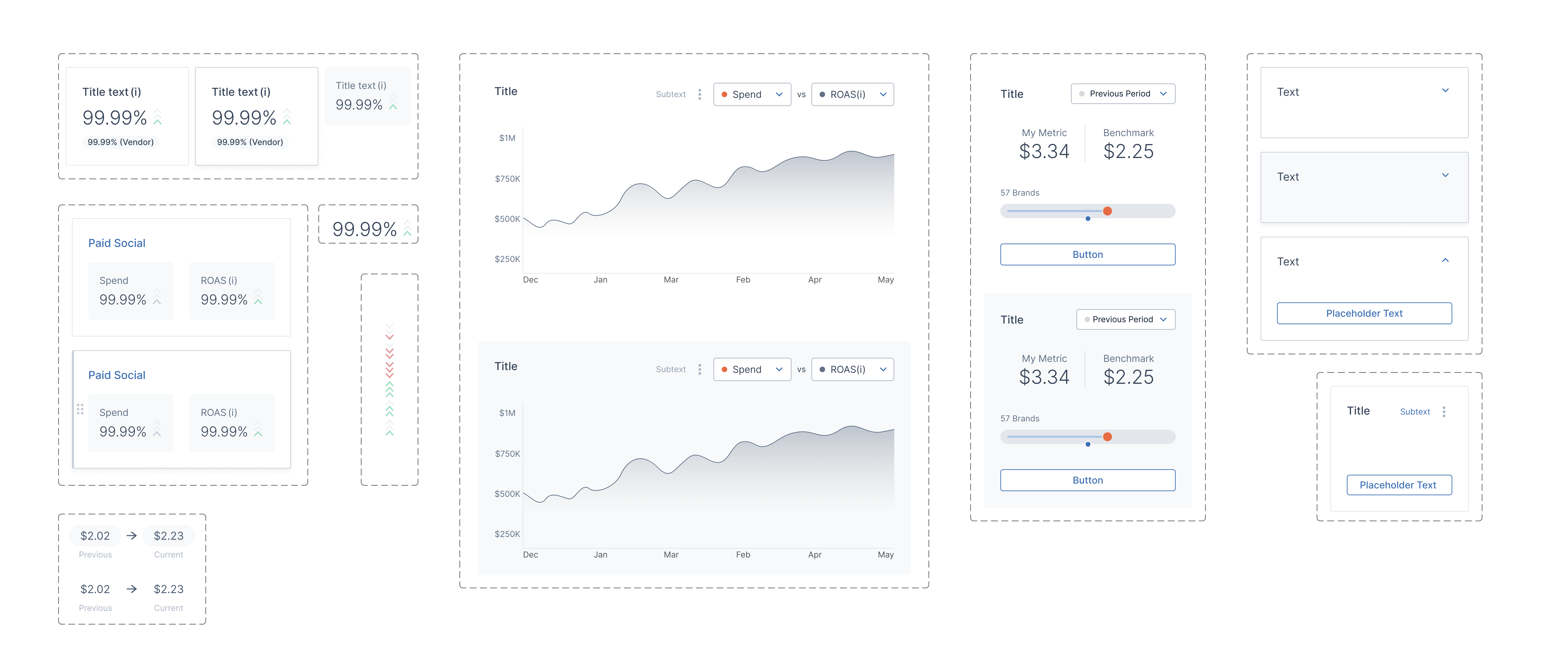
One of the largest part of the new dashboard was the updated tiles for different metrics. This resulted on these tile components. I started with the smallest part that constantly appeared, which was the stacked chevron, a new icon introduced in the redesign. This chevron was used throughout the new dashboard design, and will be continued to be used throughout the rest of the platform as the new UI continues to be implemented as a way to show the extent of growth or diminish. From there, I made the metric component, which was the number and chevron combined, also used throughout the dashboard on its own. I then made the metric tile component, with a title text, metric, and an option for a vendor comparison number under the metric. Finally, I made the channel/tactic tile, showcasing the spend and ROAS of channels and tactics.
On the very left, you can see the settings associated with the metric tiles. All the texts are editable, and different properties are very easy to customize to appear and disappear.
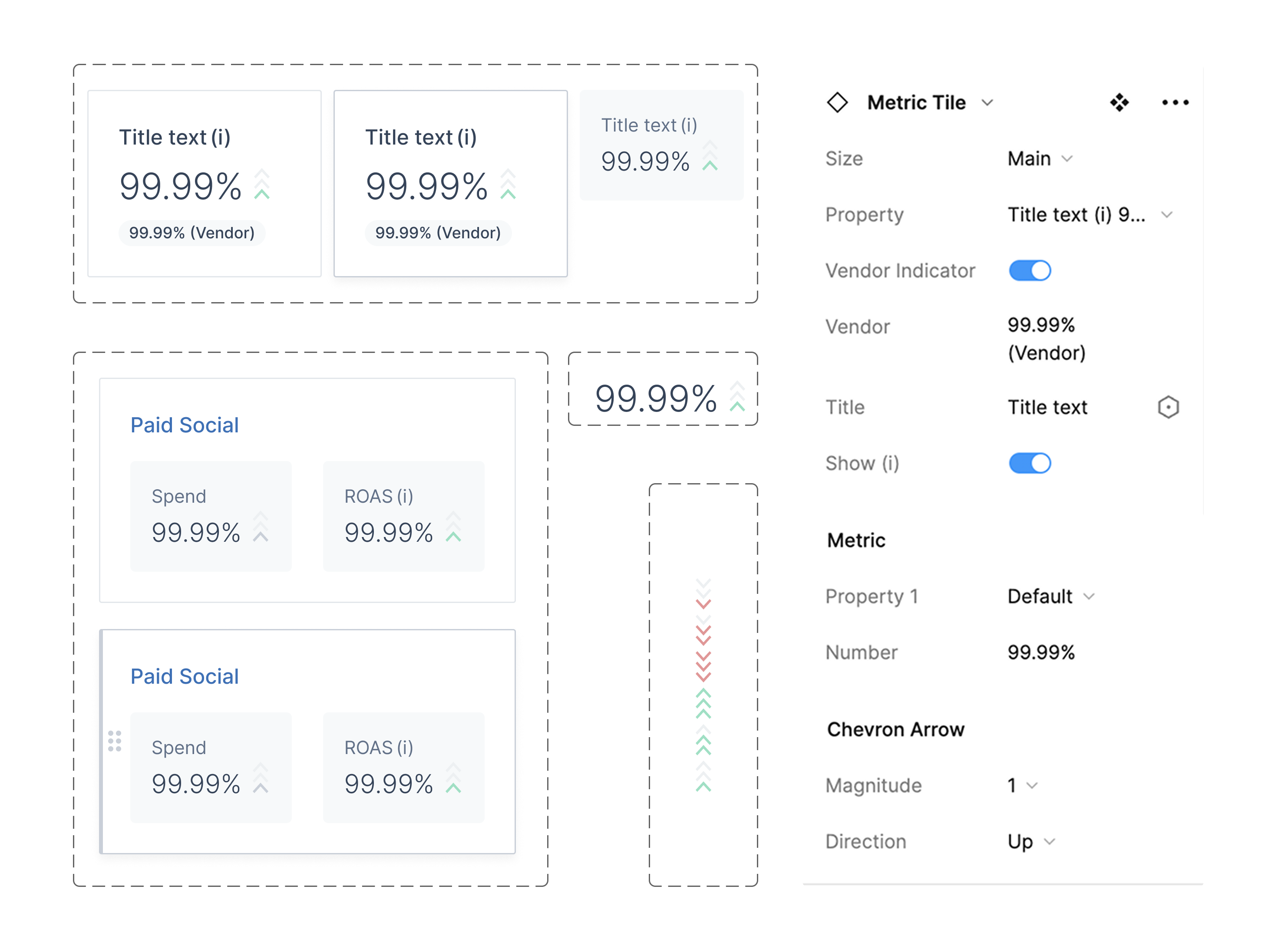
nested metric components and its settings
Tile Template
I also made an even more general tile template, where designers can detach the instance and insert their own content while maintaining typical spacing and order of features.
To use it, designers would follow these steps:
- Select which basic parts of component to keep (subtext, button, kebab, etc.) and delete them.
- Detach the instance from component.
- Insert desired content into the "content" section of the tile.
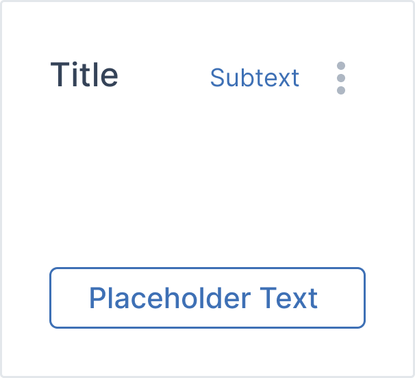
Tile Template
Final components
The finalized components that I made that got utilized in the new UI are below. Outside of the metric tiles, I also have the UI we use to indicate change inside the context menu tiles. I also made a graph tile, where the designer can easily switch between different graphs that we use throughout the dashboard, as well as a tile for the different tiles inside the context menus with content that's easily swapped. Finally, on the far left, I have two templates: one for the sidebar, which modularizes the interaction with the dropdown tile, and another for the previously mentioned general tile template.
04.
Takeaways
1. Listen to the user.
In the process of making the dashboard, we conducted a couple user interviews with existing Measured users to see how they feel about some of our design decisions. It turns out, a lot of the product decisions we had initially made didn't actually solve user burdens. Within the scope of my internship, I wasn't able to adjust the design based on this feedback, but I learned that constant user feedback is vital.
In the process of making the dashboard, we conducted a couple user interviews with existing Measured users to see how they feel about some of our design decisions. It turns out, a lot of the product decisions we had initially made didn't actually solve user burdens. Within the scope of my internship, I wasn't able to adjust the design based on this feedback, but I learned that constant user feedback is vital.
2. Make the hard trade-offs.
One of the biggest challenges I faced was prioritizing what to display on the dashboard to avoid overwhelming the user. This is especially a problem when designing dashboards, and learning how to make those trade-offs and prioritizations based on user feedback is critical in maintaining a clean and understandable interface without excess user burden.
One of the biggest challenges I faced was prioritizing what to display on the dashboard to avoid overwhelming the user. This is especially a problem when designing dashboards, and learning how to make those trade-offs and prioritizations based on user feedback is critical in maintaining a clean and understandable interface without excess user burden.
3. A design system is vital.
For a platform as large as Measured, having a scalable and organized design system can make or break the design process. Creating components based off the home page was a huge learning experience for me, allowing me to understand the importance of scalability.
For a platform as large as Measured, having a scalable and organized design system can make or break the design process. Creating components based off the home page was a huge learning experience for me, allowing me to understand the importance of scalability.