
Measured Testing Platform
Helping businesses test their current ad spend.
Role
Product Design Intern
TImeline
Summer 2024 (10 Weeks)
Tools
Figma
Skills
UI/UX Design
User Research
Product
Overview
During my internship at Measured, a data platform optimizing media spend for businesses, I led the end-to-end design of the Known Audience Testing platform. My responsibilities included conducting product discovery, collaborating with cross-functional teams, and delivering final design solutions. I focused on ensuring the platform’s value to users, making sure the information necessary for users are highlighted.
01.
Problem
Measured is a data platform that optimizes media spend for businesses. Their platform had 3 main functionalities: to test, measure, and compare.
When I first entered the company, they only had one type of testing released on their platform: geo tests. Geo tests are a marketing research method that allows you to analyze the impact of your advertising efforts based on specific geographic markets.
Geo Testing
My main task this summer was to design the testing platform for Known Audience Testing, or KAT. KAT is a marketing research method that allows you to analyze how advertising impacts the company’s known audiences (people who are aware of the business).
At this point in time, they had the functionality on their platform, but it was through a 3rd party integration. However, within the company, there was only one Solutions Manager who has worked with the product before. This meant that when I started working on the redesign, I was working with very little information about the functionality.
Original KAT Platform
02.
Solution
A centralized testing platform to optimize your ad spend and maximize results.
Features
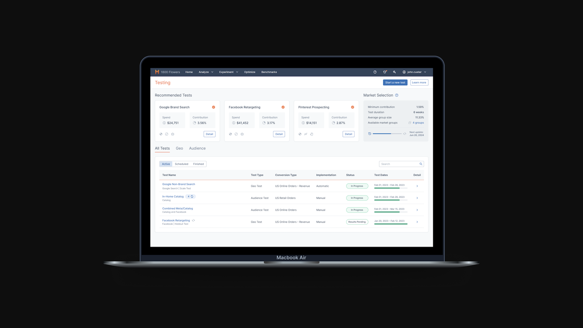
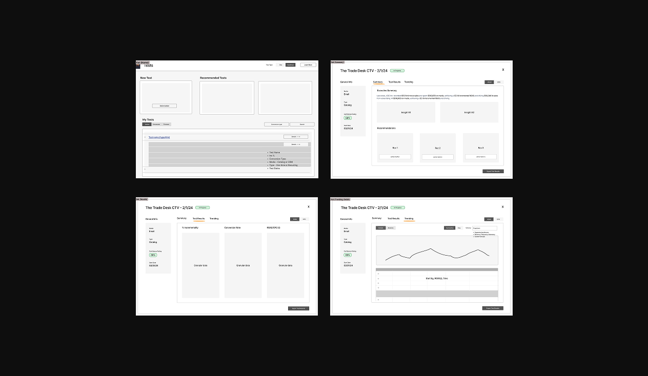
1. All Your Tests in a Consolidated Table
Users get a centralized view of all their tests, with smart filters, top recommendations, and seamless full-screen pop-ups for deeper insights.
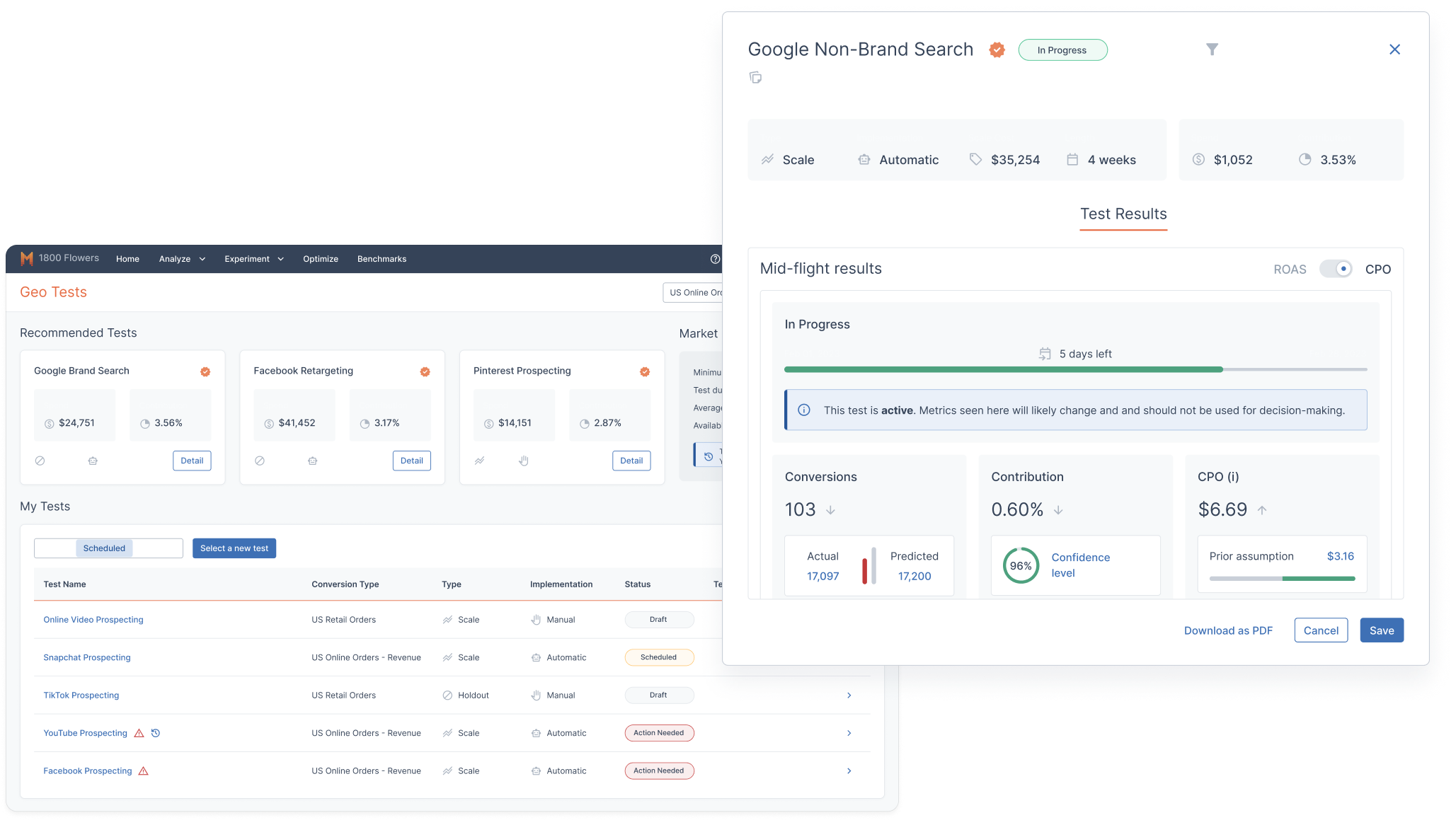
2. Test Results
The first page of the pop-up summarizes the most important insights from the tests, with evidence to back it up, and recommendations for next steps.
3. Trending Graph
User's can deep diver into the data by looking at data points over time.
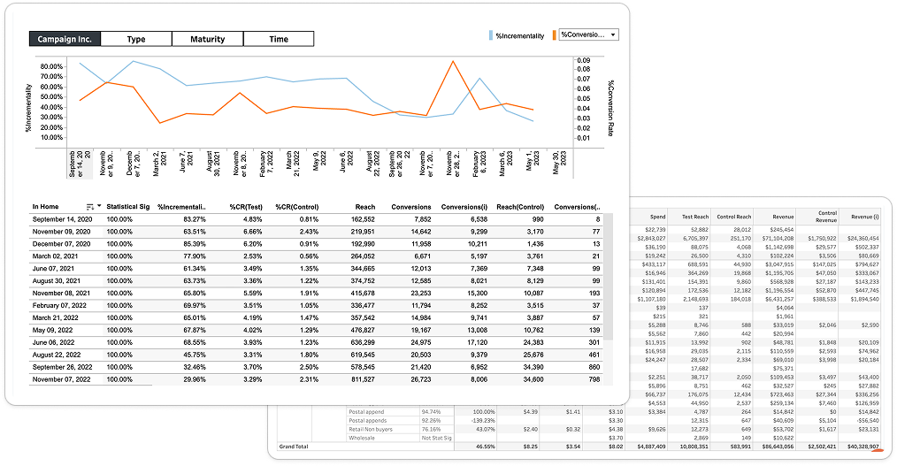
4. Drill into the Segment Table
Users can get the deepest dive into the data by looking at the segment view, with customizable segments.
03.
Process
Product Discovery:
I started the product discovery process with artifact analysis, which was essentially defining each feature on the existing Tableau page to understand function and purpose. I did this through information gathered talking to people internally as well as my own online research.
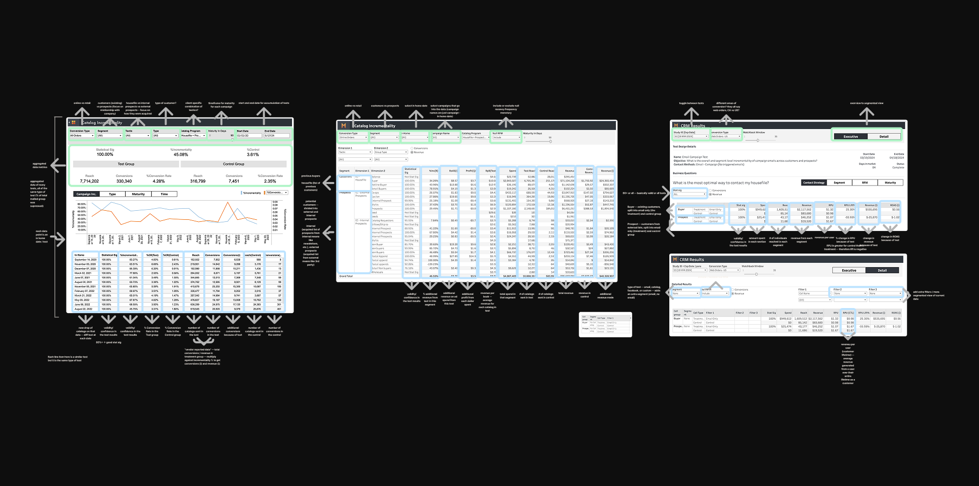
I continued on to map out the current work flows. Using company resources and interviewing people involved in the process, I was able to create overarching flows for how our current Solutions Manager brings insights to clients and how different 3rd party agencies were involved in the process.
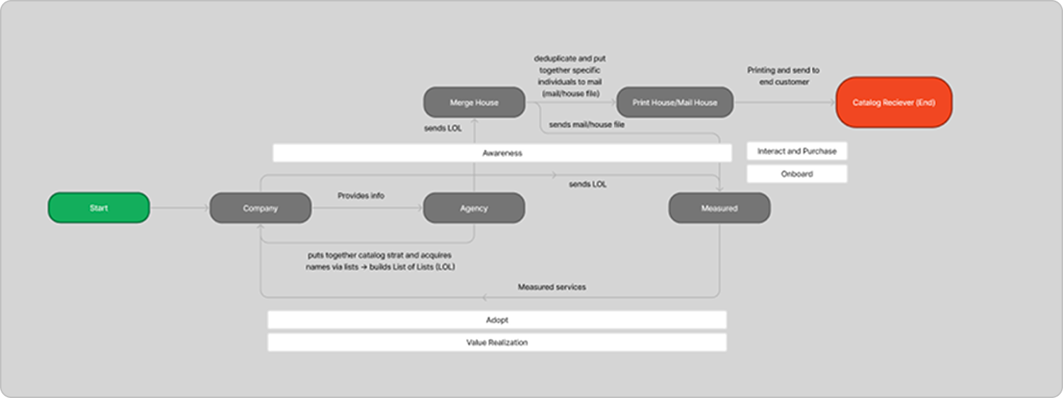
3rd party agencies flow
current solutions work flow
Together, with these two forms of analysis, and a deep dived conversation with our Solutions Manager, I was able to find out the following informations.
What is KAT?
One-Time Tests
- Typically a combination of digital & Catalog (ex: Snapchat + Catalog)
- Test occurs once with a length of 6 weeks
Recurring Tests
- Only Catalog
- Tests occur every drop date of Catalogs
- Test occurs recurrently over the Catalog’s lifespan
Catalogs are referring to the magazines that brands send to your mailbox. These catalogs are usually updated and sent out recurrently. Each time they're sent out, this is referred to as a "drop date". They typically find who to send their catalogs to through their known audiences (if you constantly receive mail from the same brand, you're probably a known audience).
Insights:
What information to emphasize.
I found that Spend, % Incrementality, Incremental ROAS, and Statistical Significance were the most important metrics for users to know.
I found that Spend, % Incrementality, Incremental ROAS, and Statistical Significance were the most important metrics for users to know.
What segments to create insights
I realized that the bulk of the information on the current platform is the segmented table. Users use segments to divide data up into more granular numbers, providing insights on which specific type of user provides the most return on ad spend. I found that Tactic, RFM, and Type were the most vital segments for users to deep dive into.
I realized that the bulk of the information on the current platform is the segmented table. Users use segments to divide data up into more granular numbers, providing insights on which specific type of user provides the most return on ad spend. I found that Tactic, RFM, and Type were the most vital segments for users to deep dive into.
Main objective of users
Users' main objective was to accurately measure the effectiveness of current marketing campaign to optimize and improve current strategies.
Users' main objective was to accurately measure the effectiveness of current marketing campaign to optimize and improve current strategies.
Things to Improve:
- There' an overwhelming amount of data on the current platform, and users often require Internal Measured help to understand what this means for their brand.
- Known Audience Testing's UI feels like a completely different platform, and it's often jarring to enter from another page of the website.
- There’s three different user facing platforms involved in Known Audience Testing, and they all essentially do the same thing.
How might we
How might we design a clear and streamlined Known Audience Testing platform for marketing managers in small-to-medium businesses in order to analyze and improve their current marketing spend?
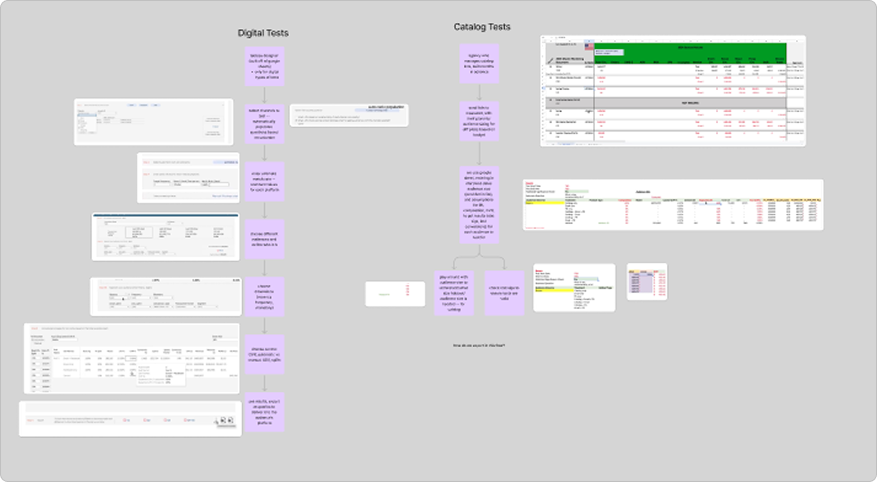
Low-fidelity
We started by rapidly iterating on the general layout in Figjam. We wanted to get out as many ideas as possible before moving onto using the design system.
Our lowfi iterations
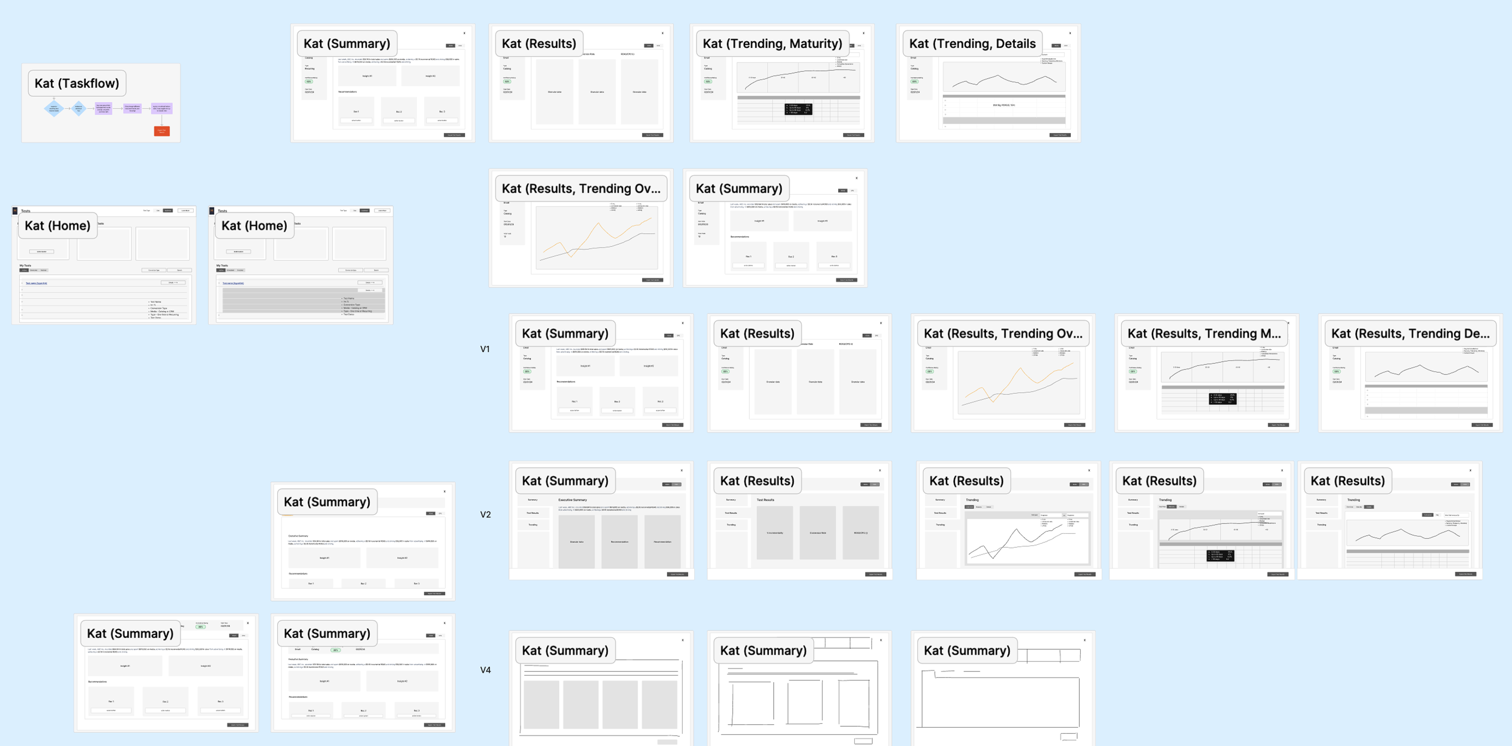
After many iterations, our final lowfi flow is to the right. The flow will start from the home page, which combines Geo and KAT tests. The user will be able to toggle between the two tests, and the table will only show that individual type of test. For recurring catalog tests, users will be able to access each individual test from a drop down in the tests home page.
Users can then open a pop up to see the test results, which will occur over 3 tabs: Summary, Results, and Trending. We decided to use a full-page pop-up instead of a smaller modal like the Geo tests previously used to allow for text expansion, changing Geo's UI as well.
Mid-fidelity Iterations
First Iteration
The first iteration after using the design system is shown on the right. While the low-fidelity was a good start, I received feedback that the information was too dispersed, and that too much information was provided to the user.
As a result, I decided to update the design to combine all the vital information on one Summary page, including the trend graph, summary, and evidence. The Details page showed each recurring test and their basic information.
However, I realized that the graph shouldn't be on the same level of importance as the rest of the summary page, as it's not directly providing insights to the user.
Second Iteration
Since I realized that the graph shouldn't be included in the summary page, I decided to put the trending graph in the details page with the recurring tests. This also allowed the executive summary to be at the top, which allows users to see the most important information at a glance.
At this point in the design, the UI was still messy, and not fully refined. There was also no action items for the user to take, and there was no functionality to allow for users to deep dive into segments.
Third Iteration
In the third iteration, I cleaned up the UI of the Executive Summary, letting it be easier to read. I also allowed the functionality for users to click on each summary point to bring them to the evidence to back it up. I also added recommendations for action items to improve their ad spend based on their test results, and added a segment table to the Details page. I also removed the recurring tests table and replaced it with a drop down to switch between individual tests. Since the Details page's main functionality became looking at trends, we renamed it to "Trending".
In my design, I included recommendations for next steps. This is because I didn't want my design to just be a UI wrapper of the previous 3rd Party design. I wanted to provide real value to the user, and that's only possible through recommendations–what can you do with this information?
However, our engineering team didn't have the time to create an algorithm within the sprint, and our team wanted to push this platform out as fast as possible. That's why I decided to create a back-end, where our Solutions Manager could manually input the recommendations. This was a similar flow to his current work, but without the need to create a slideshow for each individual client. The majority of the design was already in Engineering's design system, making it a much easier build compared to the recommendation algorithm.
Jump Back to Final Product04.
Takeaways
1. Understanding the product is vital, especially for designers.
Since I was the sole designer on product discovery, I was able to fully understand the product and user needs. This resulted in my designs taking user needs into great consideration, allowing for a great product that is truly useful to the users to be designed. I was able to back my design decisions with real user feedback and insights, allowing me to have full confidence in my designs.
Since I was the sole designer on product discovery, I was able to fully understand the product and user needs. This resulted in my designs taking user needs into great consideration, allowing for a great product that is truly useful to the users to be designed. I was able to back my design decisions with real user feedback and insights, allowing me to have full confidence in my designs.
2. Iteration and feedback is key.
Throughout the entire design process, I was constantly looking to different teams, clients, and designers for feedback on my design. Having their different perspectives allowed my designs to be the best that it can be. I was able to factor in all the limitations and ideas to create a successful design.
Throughout the entire design process, I was constantly looking to different teams, clients, and designers for feedback on my design. Having their different perspectives allowed my designs to be the best that it can be. I was able to factor in all the limitations and ideas to create a successful design.